
With the first core release, we've been focusing on something functional even if it isn't pretty. Right now we're specifically focused on bug testing and documentation to round out the core release. From there will be taking a fresh look at everything to see what can be improved and how we can make the whole experience more polished. Today the blog post is going to be on the login screen.
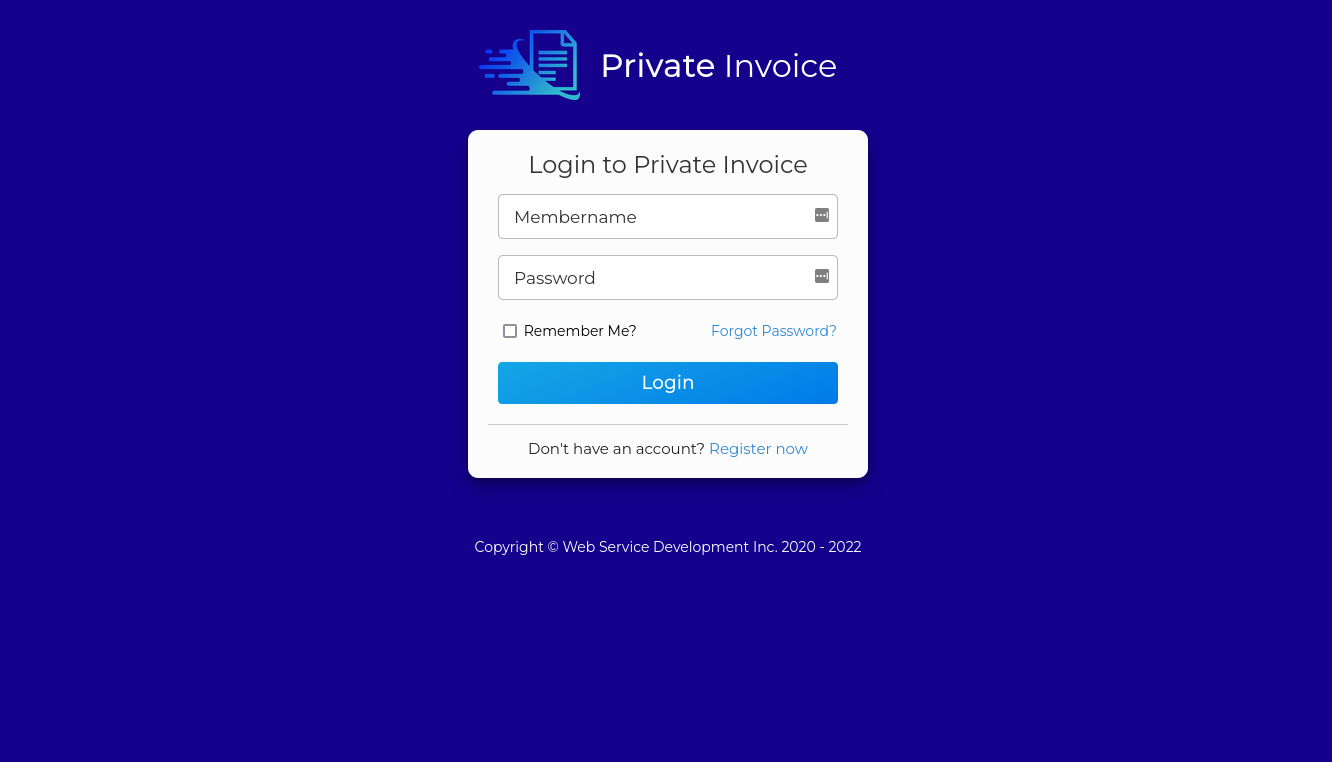
Right now we have something that is functional. But over all pretty drab. I think we're going to want to improve in the visual department with something more appealing.
We can make a block out of this this that make some small improvements in terms of layout. We can have a card on the right, and the login screen on the left which is something akin to the sign-in-side material ui example.
We can block this out in Figma and we come up with the following design.
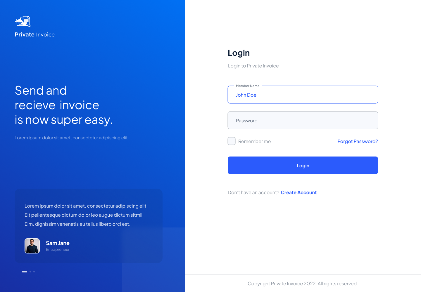
Over all I think this look is really classy. And I'd love to expand on it. I think there are a few potential improvements that we could make on this.
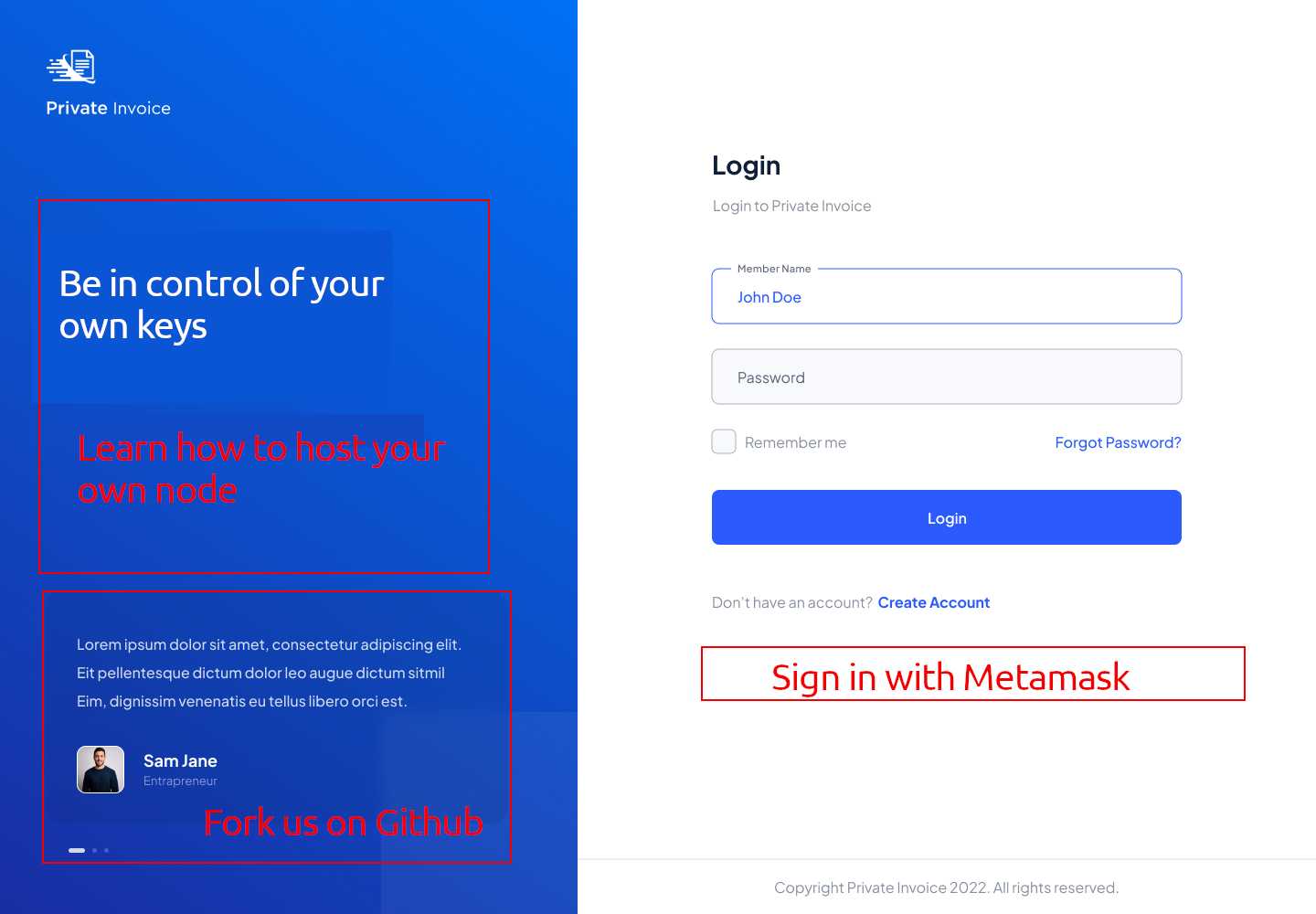
On the left side I think we could use this space as a call to action to say that, "this node is self-hosted, and you can make one too". Maybe something to the effect of something like Ghost or Wordpress that is a self-hosted blog. Or the person hosting might want to have a logo for their organization or instance here.
On the bottom left, I think we would want to draw attention to the fact that the Private Invoice project is completely open source, and that you can go and see the source. On the right side, I think the main thing is that we would want to sign in Metamask as opposed to OAuth2 services to move the keys more in control of the owners. So this is a tech-spike that I think we want to prioritize.
In the next blog post we can go over the sign form and see what design updates we can make there to make it better.
