
Th next aspect of our application to take another look at is the onboarding form. After the login screen, this is your second impression of the application and it's important to give people a good impression of what they're signing up for.
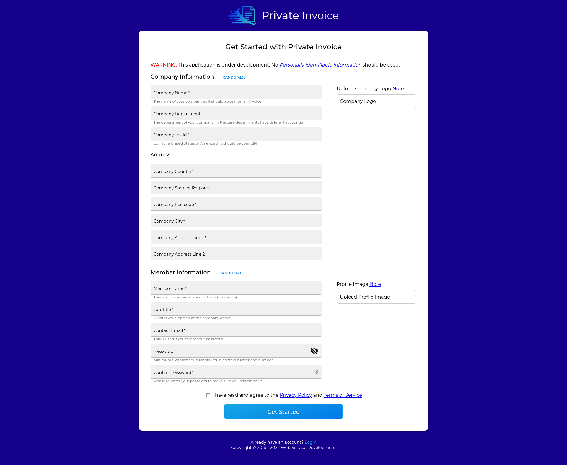
Overall currently I think we have a functional, but not elegant form. In this case we really have three separate forms.
- Company Information
- Company Address
- Member (default admin) information
In terms of a block out with a stepper form, the new flow would look something like this.
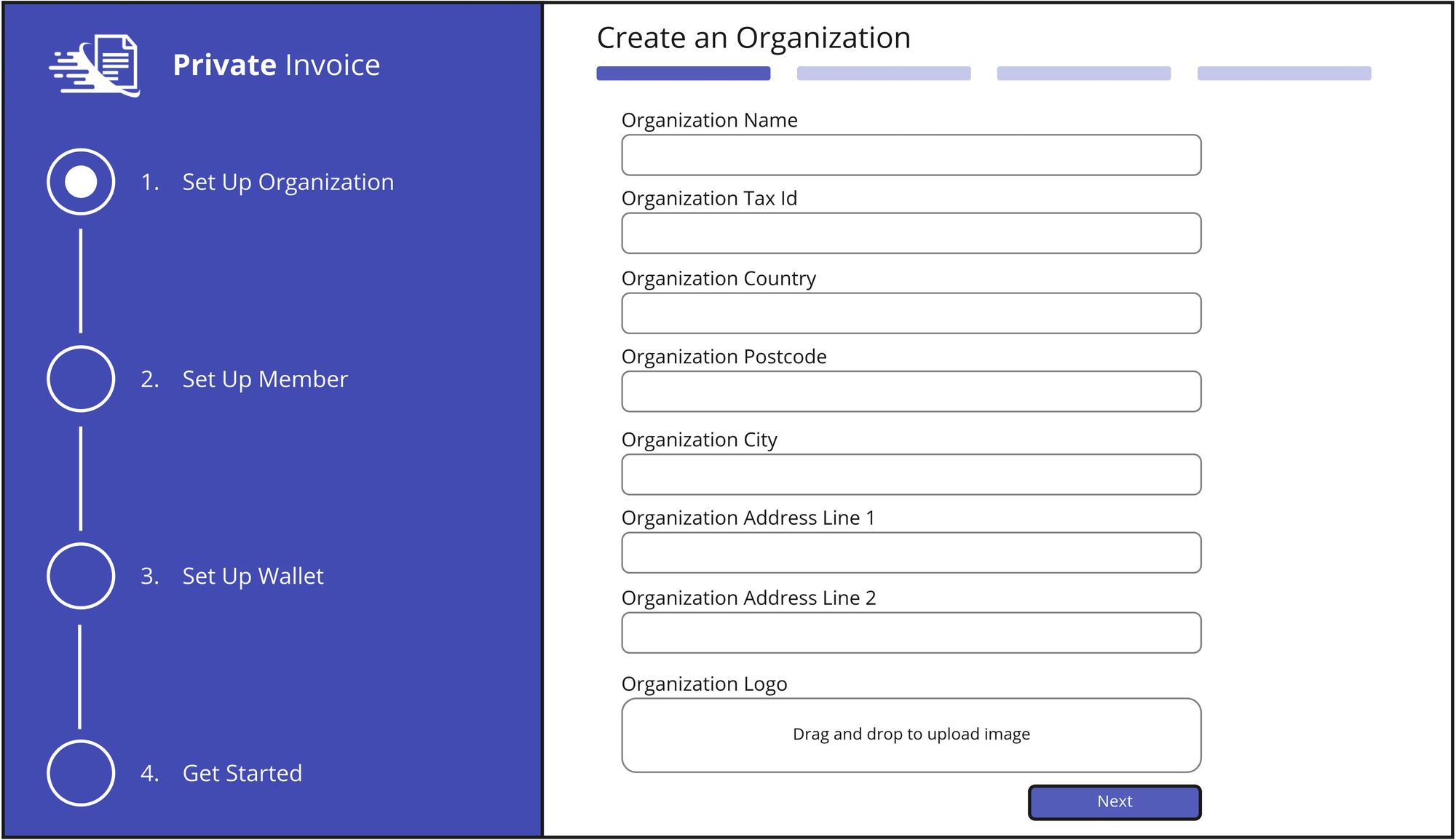
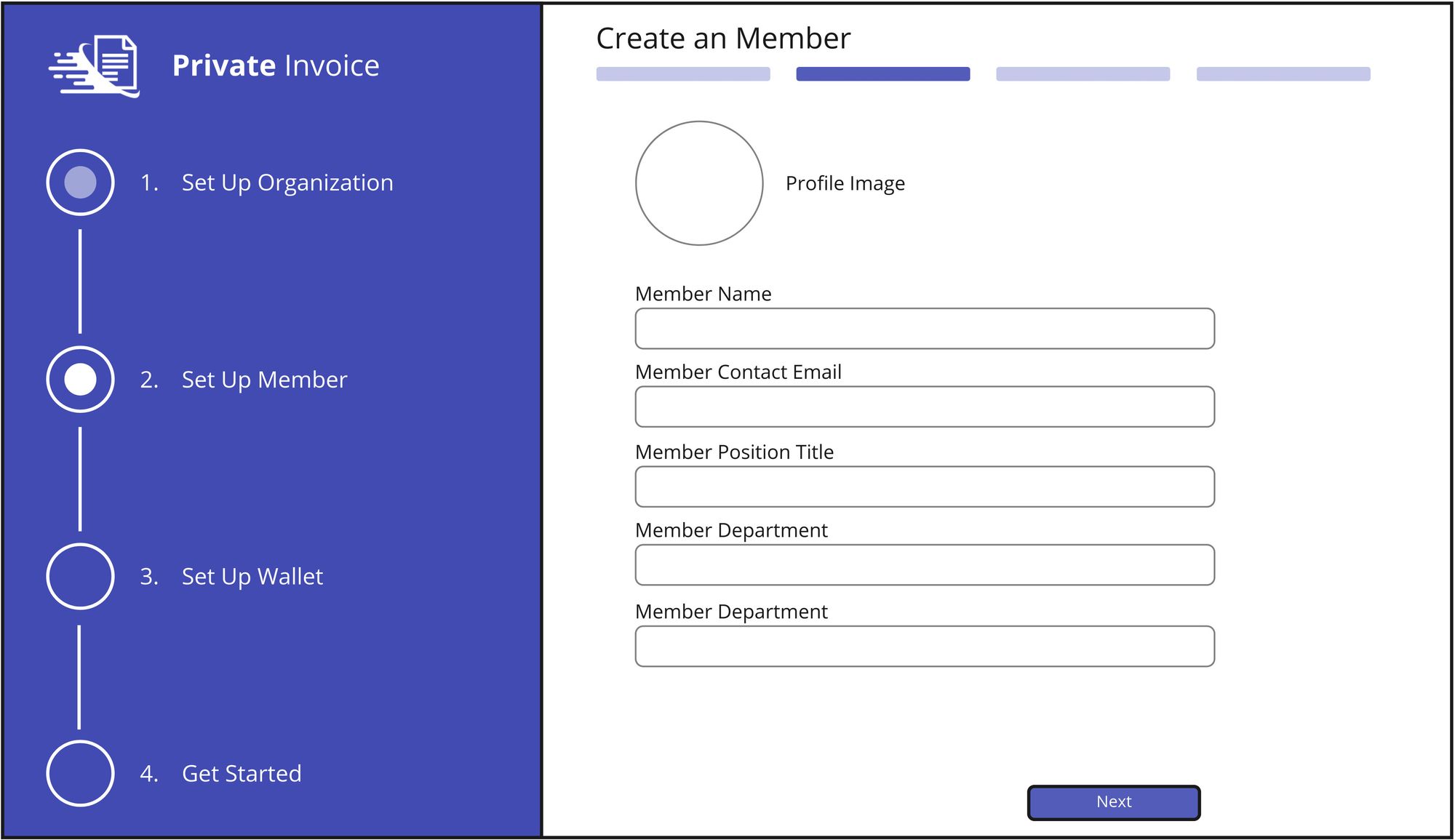
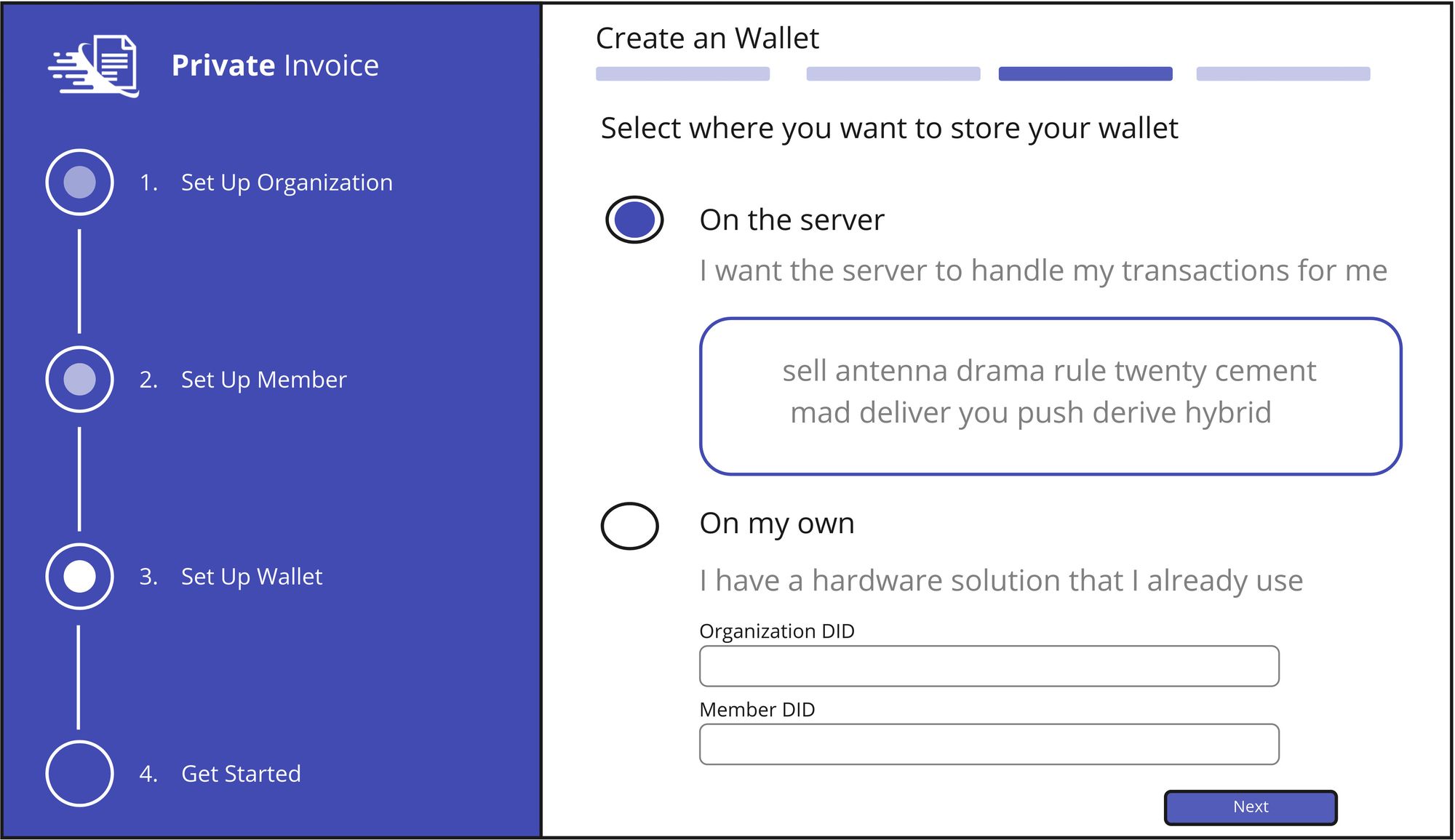
First we have the perspective user enter company information, then profile information. And then we give them a selection of how they would like to store their keys. This would be another example of Metamask integration that we still haven't looked into.
My other self-crisitism of this block out is that organization sign up form comes out as pretty cramped. I think we might want to split out the address information into a different form. And if we don't have the ability to use private keys, then this might not be an option that we want to include yet. But this is all speculative as we make these designs to make decisions about which tech spikes to prioritize for the next realize. And since Metamask has come up twice, that makes it a higher prioiroty.
Enough musing about crude block outs. Let's take a look at a figma mock up of the same flow.
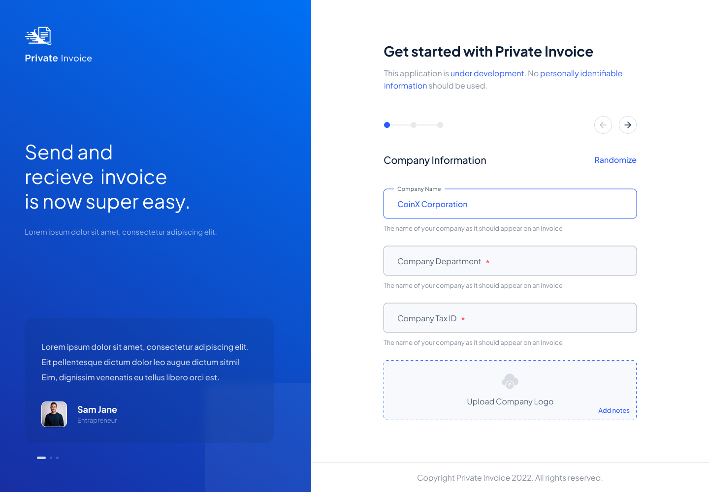
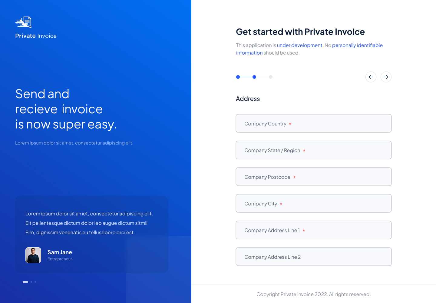
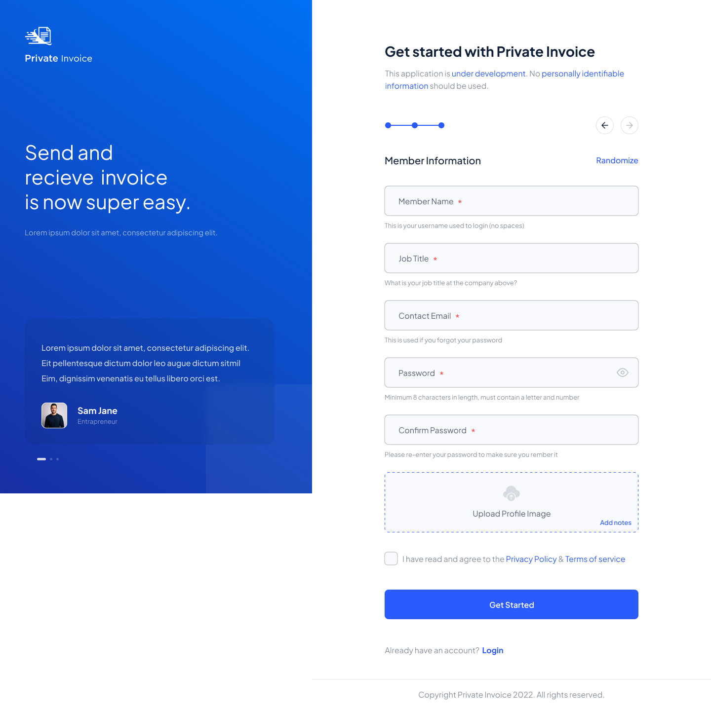
I'm loving this version as it's a super clean version of what exists now. I think we might need a Randomize button for the address as well if the form is split out like this. Otherwise it is a seemless transition to and from the login screen.
And until we have specific criteria about how we handle keys during the onboarding flow, I really have no issues with this version of the design. In the next blog post. We will take a look at the main application page to see what changes we make there.
